
Introducing an interactive Purview map
Solving years of frustration and closing the loop on how to get the Purview knowledge across. Introducing an interactive map to help explain the Purview concepts, and relationships within Purview more

If you’ve ever tried to explain Microsoft Purview to someone in a single sitting, you know the problem. You start with sensitivity labels, and within ten minutes you’re three browser tabs deep, sketching arrows on a whiteboard between DLP, Insider Risk Management, eDiscovery, Information Protection, Data Lifecycle Management, and whatever was renamed last quarter. The person you’re explaining it to nods politely. They don’t actually get the fastness of Purview. Honestly, neither did you at the start, at least not all at once.

That’s a bit of frustration that helped push me to build this.
I’ve spent a lot of time inside Purview in my role as a consultant. Designing roll-outs, fixing broken ones, training admins, walking compliance officers through what their organization actually has versus what they think it has. And the same thing kept happening on every engagement: people understood the pieces of Purview, sometimes deeply, but they couldn’t see the shape of it. Where does a sensitivity label end and an auto-labeling policy begin? Which workloads does Endpoint DLP actually cover? If I turn on Insider Risk Management, what does it borrow from Information Protection to work? How does any of this land in Teams, SharePoint, or Exchange?

These aren’t trick questions. They’re the questions you have to answer before you can architect anything sensibly. But the answers are scattered across dozens of Microsoft Learn pages, blog posts of varying freshness, and the lived experience of people who have learned the hard way. I didn’t found a single picture that explains it all.
So I made one, pair-programming it together with Claude across a long series of build sessions where I’ve developed a new frustration - out of credits….

Between the 5-hour credit limits I was facing, “magic” happens. I’d describe a relationship I wanted to express, Claude would propose a structure and I’d push back on what didn’t match the reality of the product, and we’d iterate. The map you see today went through a lot of versions before it stabilized, and it’s still moving.
This is not something I want to keep for myself, as I recon a lot of people are looking for something like this. So you can all enjoy purviewmap.copilotatwork.nl.
What’s in it
A few of the things I’m most pleased with:
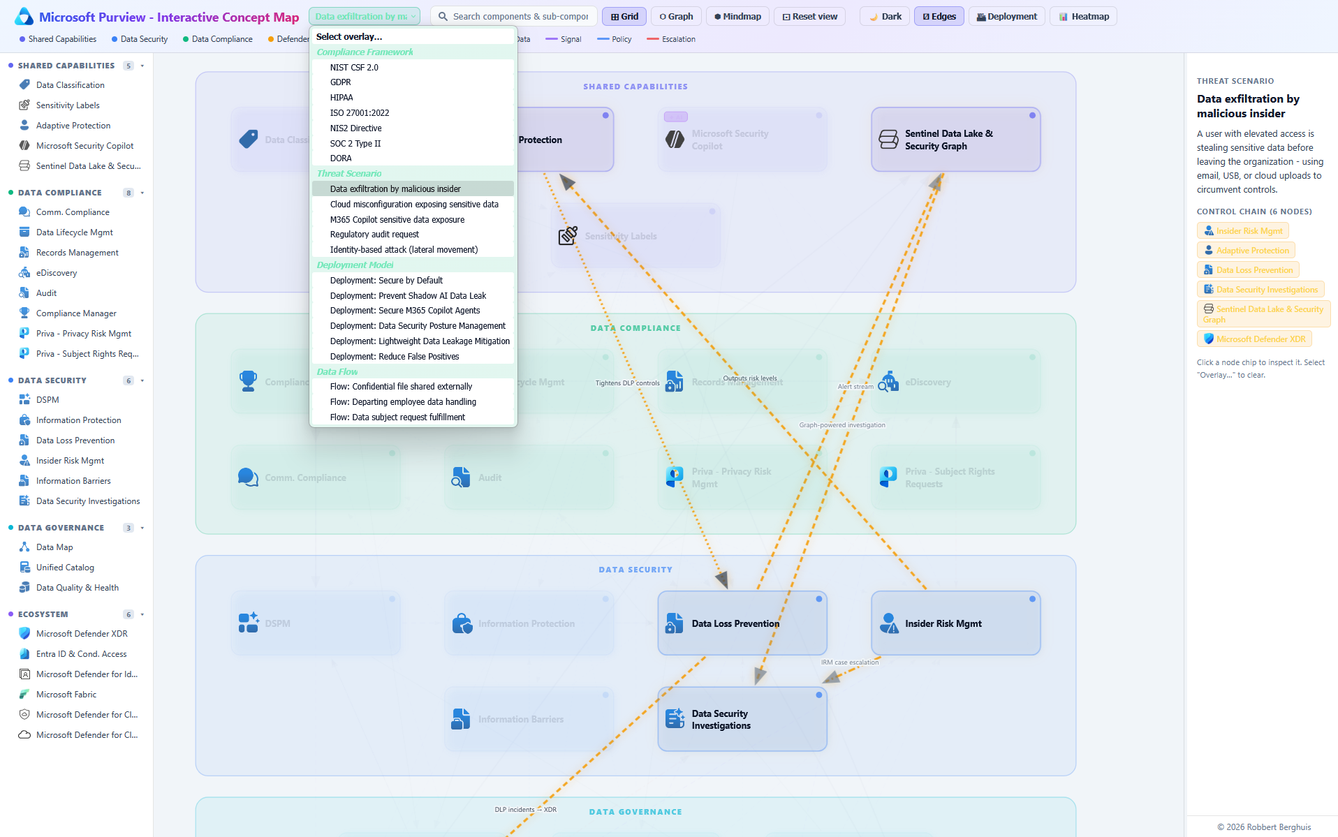
Three views of the same data. A grid for fast scanning, a graph for seeing how the solutions actually connect, and a mindmap for drilling into one solution and its sub-components. Same underlying model, different lens depending on what you’re trying to learn or get across in your conversations.
Workload compatibility, made explicit. Every capability shows which Microsoft 365 workloads it actually covers: Exchange, SharePoint, OneDrive, Teams, Endpoint, Fabric, third-party. No more guessing whether a feature you read about applies where you need it.
A deployment overlay. Switch it on and the map reorders itself around rollout sequencing, what depends on what, what to turn on first, what waits until later.
A heatmap overlay. Shows where Purview’s coverage is dense versus thin. Useful for honest conversations about the gaps, not just the marketing surface.
Edge toggles. Simplify the graph down to just the relationships that matter for your current question, instead of drowning in everything at once.
Who it’s for
For architects, it’s a planning surface. See at a glance which capabilities lean on each other, so you don’t switch on something downstream before its prerequisites exist.
For admins, it’s an orientation map. New to Purview? Start at the center, follow the edges, see how your daily work in DLP or labeling sits inside the bigger picture.
For compliance and security leads, it’s a conversation tool. Bring it into a meeting, point at a node, and have a real discussion about what’s in scope and what isn’t without anyone having to memorise the catalogue.
Purview isn’t going to get smaller. Microsoft keeps adding to it, and that’s mostly good news! The platform is genuinely capable. But capability without comprehension is just noise. The map won’t make Purview simple, because Purview isn’t simple. What a map can do is give you a place to stand while you figure it out.
That’s what this is. I hope it’s useful. If you spot something missing or wrong, let me know! It’s a living thing, and I’d rather have it be right than finished.